

Data analysis is no longer a slow, manual process. Today, platforms like Looker Studio They allow you to automate reports with great accuracy. This free Google tool makes it easy to create automatic dashboards, ideal for those who need up-to-date information at all times.
By connecting different sources and creating customizable visuals, Looker Studio It becomes a powerful ally in decision-making. Automating reports not only saves time, but also improves understanding and tracking of key objectives.
If you manage marketing, sales, or web performance campaigns, learning to master this tool can transform your workflow.

What is Looker Studio?
A data visualization platform connected to Google
Looker Studioformerly known as Data Studio, is a free tool for the data visualizationIt allows you to transform raw data into understandable and attractive graphs, tables, and indicators.
It works by connecting to data sources such as Google Analytics, Google Ads, Sheets, BigQuery, and external platforms. Its visual approach allows for the creation of automatic dashboards and real-time reports intuitively.
Advantages over manual reports
Automate reports with Looker Studio It has multiple benefits. It reduces human error, eliminates repetitive tasks, and offers effortless, constant updates.
Furthermore, you can easily share the reports. Everything is automatically updated from the source without needing to export files or send emails.
How to get started in Looker Studio?
Create your account and connect your data
Access Looker Studio From your Google account. Once inside, choose "create report" and connect a data source.
The most common connections are Google Analytics, Google Ads, and Google Sheets. You can also connect external APIs or use third-party connectors.
Choose a template or create from scratch.
You can use pre-designed templates to make the design process easier. If you prefer complete customization, start with a blank canvas.
Drag and drop elements such as charts, tables, or maps. Customize colors, filters, and dimensions according to the report's objectives.
Key elements for automating automatic dashboards
Selection of relevant metrics
Before designing a dashboard, define the key metrics. You don't need to display everything, just the data that helps you make decisions.
For example: conversion rate, clicks, impressions, revenue, bounce rate, or active users. Less is more in a good dashboard.
Use of filters and interactive controls
Add filters that allow the user to modify the date range, traffic type, or device. This improves the dashboard's usability.
Thus, each user can adapt the data visualization to their needs without modifying the original design of the report.
Automatic update settings
Looker Studio It extracts data directly from the source, so the real-time reports They are updated without intervention.
If you use spreadsheets, make sure the data is always up to date. The same applies to other external sources.
How to share your reports in real time
Customized access and editing control
You can share your dashboards with view-only or edit permissions. This way you maintain control over who can modify data.
This function is useful for large teams or clients who only need to consult the information without altering the structure.
Insertion into websites or presentations
Looker Studio It allows you to embed dashboards in websites or presentations. You only need the embed code generated by the platform.
This is ideal for executive reports, client areas, or live updates from your internal or external site.
Practical examples of automation with Looker Studio
Digital marketing campaign tracking
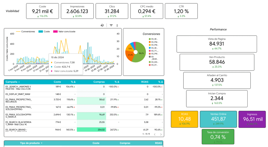
Connect Google Ads, Analytics, and Search Console to create automatic dashboards that show clicks, conversions, and performance by channel.
You can filter by dates, specific campaigns, and device type. This gives you a complete analysis without needing Excel spreadsheets.
Visualization of sales data and CRM
If your sales team works with spreadsheets or CRM with connectors, create a dashboard with leads, closings, and sales projections.
This allows you to see the status of the sales funnel in real time. Ideal for making quick decisions without waiting for manual reports.
Reports for e-commerce and products
Connect platforms like Shopify or WooCommerce using connectors. Measure sales, average order value, and performance by category or SKU.
The real-time reports They help detect trends and adjust prices or promotions based on real-time data.
Best practices for data visualization
Keep the design clean and focused
Avoid cluttering dashboards with unnecessary data. Use consistent colors, visual hierarchy, and group related metrics.
Visual clarity is key to a good experience. If everything is important, nothing will be important to the report's reader.
Use comparisons and time evolution
Comparing periods improves understanding. Add growth or decline metrics with arrows, percentages, or visual indicators.
This improves the data visualization and allows for quick interpretation of KPI behavior over time.
Review data sources periodically
Although the process is automatic, make sure your fonts are configured correctly, especially if you're using manual spreadsheets.
A single error at the source can affect the entire dashboard. Review formulas, permissions, and field names to ensure consistency.
Looker Studio It positions itself as an effective solution for automating reports, visualizing results, and optimizing analysis processes.
By leveraging its features to create automatic dashboardsYou can save time, reduce errors, and make decisions with better data.
In addition, having real-time reports and a good data visualization It enhances the efficiency of teams, campaigns, and businesses.
Start by connecting your data, define the most relevant indicators, and design simple dashboards that you can scale over time.
Automating reports is no longer an advanced option, but an essential practice for growth in a data-driven environment.
